The world of AI is exceptionally fascinating. Within minutes, you can create a proof of concept for nearly anything. Often, we have set images in our mind’s eye of what we expect by issuing our prompts to generative AI programs such as Stable Diffusion, Midjourney, and even Chat GPT. And while it does need lots of human guidance, it’s important to note that it can only function because of the non-artificial work that feeds its algorithm. It’s kind of a symbiotic relationship.
At FUEL, we’ve enjoyed experimenting with some of these tools and are almost always surprised by the results. We’ve even found ourselves laughing until we cry at the unexpected, or feeling suddenly inspired by an unanticipated detail generated by the program. We can’t help but believe that there really are so many opportunities and possibilities here, but not in the same way that a lot of the hype would have us believe. In our minds, it’s less about AI replacing us in brand design, and instead about freeing us from the limits of our own imagination.
Case in point: our client Christmas cards this year. We thought it’d be fascinating to give Midjourney the task of recreating the classic theme of “Twelve Days of Christmas,” only this time featuring different artwork styles. Finding acceptable images for all twelve took longer than expected, so we thought that sharing our findings could help others as they explore the world of Generative AI.
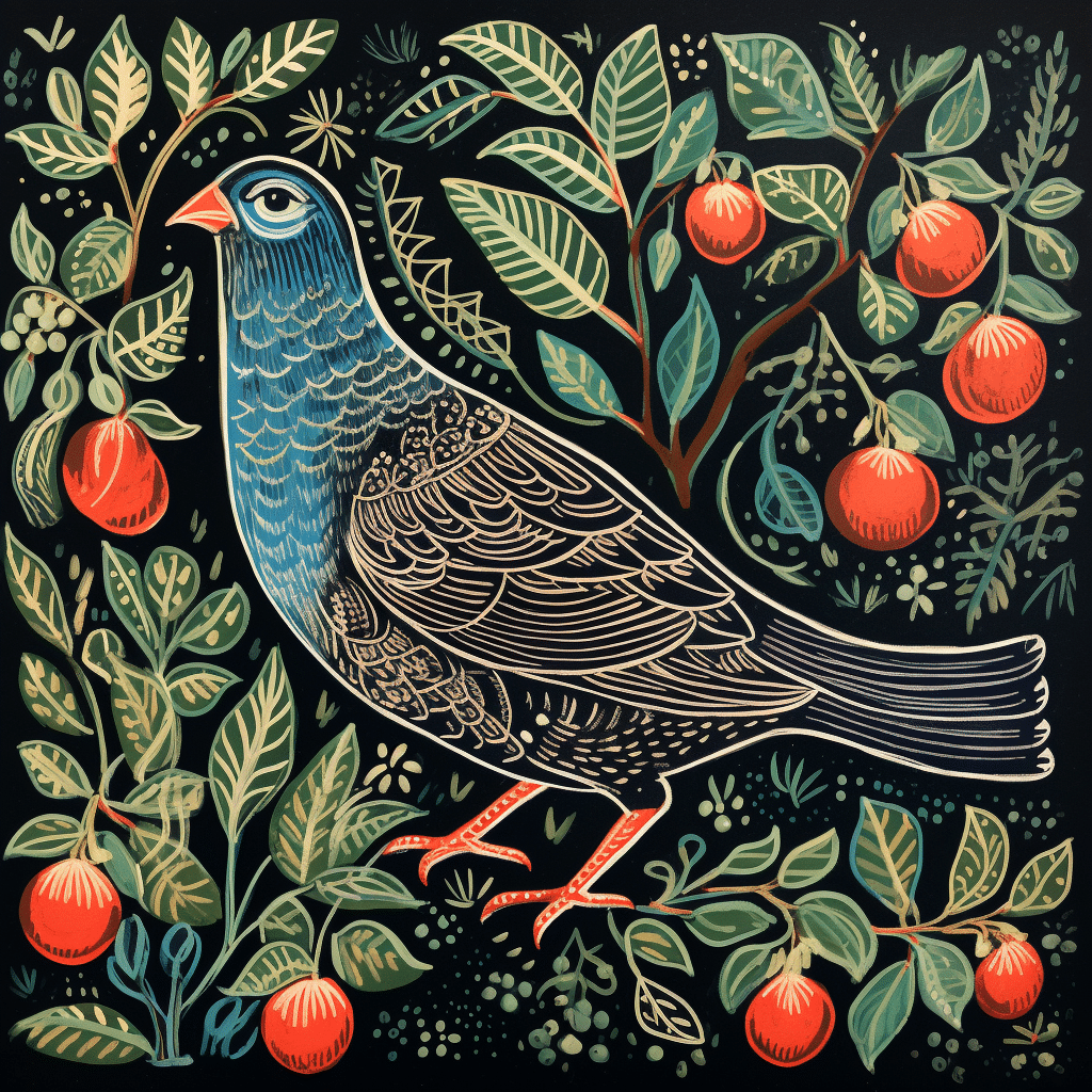
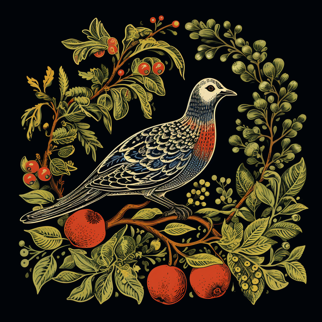
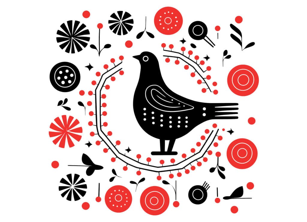
1. Patridge in a Pear Tree, block print style
Fail: We tried both woodcut and block print styles. MidJourney sourced incorrect bird species; however, to be honest, I’m not super familiar with partridges. This failure wanted to drive a bus, not sit in a tree. (It looks like a pigeon if you didn’t get the joke.)
Final: While this is too detailed to be a traditional block print style, the first prompt turned out beautifully—so much so that we immediately saved it. Also, those are no pears, but we decided this one was a go.
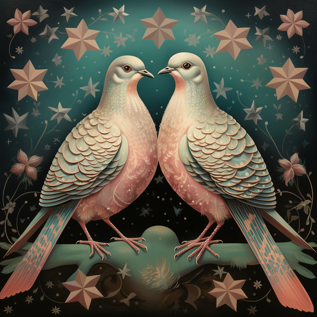
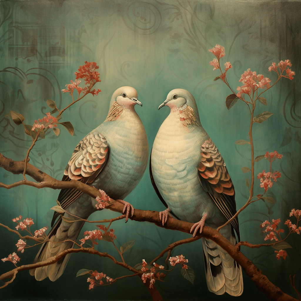
2. Two Turtle Doves, retro style
Fail: Birds and retro style were a good match. Most of the options were decent, but this fail was too modern.
Final: “Retro” is a little vague, but we loved the vibes of this option evoking old-school vintage wallpaper and a muted color palette.
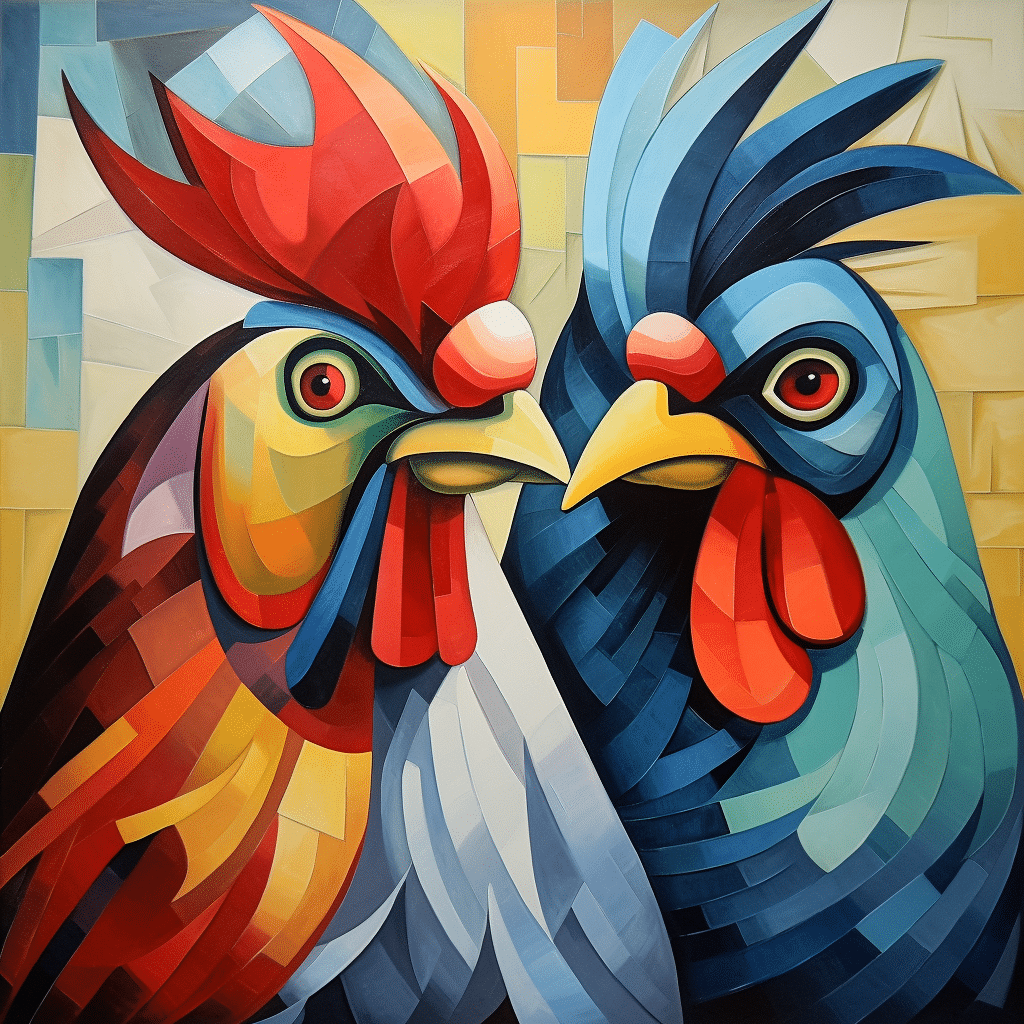
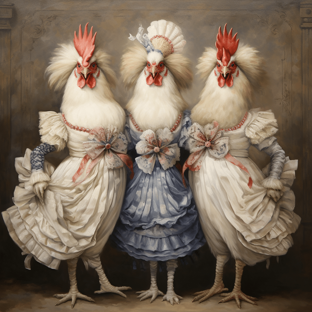
3. Three French Hens, no style selected
Fail: These two hens were not the least bit French, so we removed the style altogether.
Final: When trying to select a style, we got a lot of standard hens. We felt AI could imagine something more intriguing. After letting Midjourney choose, we finally got these fashionable hens showing off their legs. Mission accomplished, ladies.
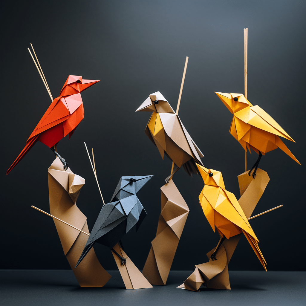
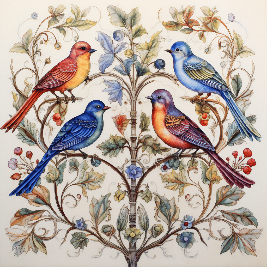
4. Four Calling Birds, ornamental watercolor style
Fail: We liked the idea of the origami style, but these five (not four) birds were creepy and looked like skewers. We went with a style that was more appropriate.
Final: This looks like a beautiful, illuminated piece by an old master. Well done, Midjourney!
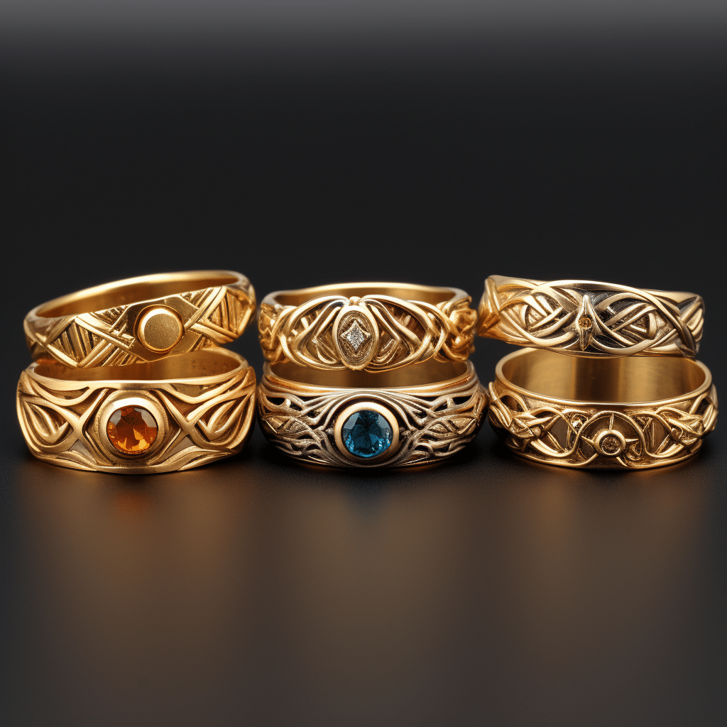

5. Five Golden Rings, winter oil painting style
Fail: Here, we have six rings, not five. And they aren’t visually attractive in the least. We tried five other styles, including op art, graffiti, isometric illustration, futuristic, and even diagrammatic portrait style, just to see the results since this was the most challenging concept to work with.
Final: We’re getting some serious Rings of Power vibes, but it got the job done. The only thing missing: the Eye of Sauron.
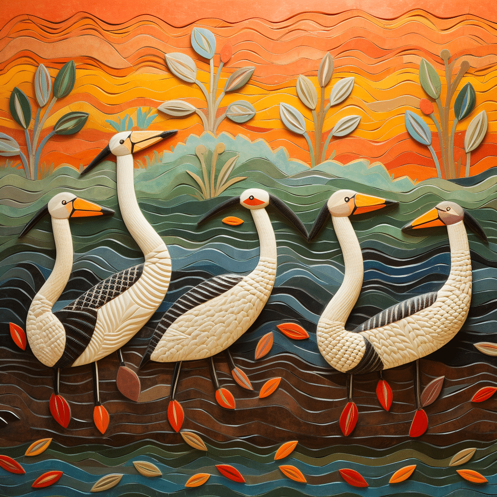
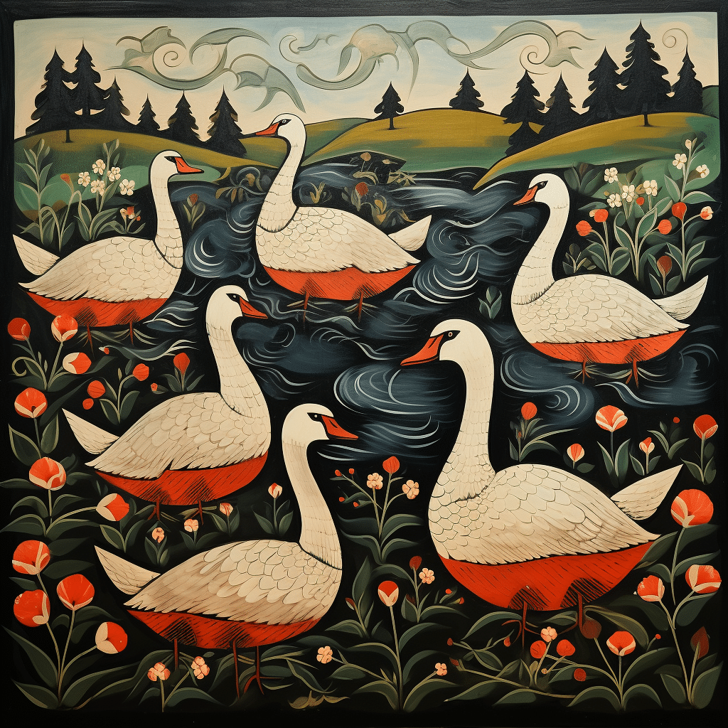
6. Six Geese a-laying, folk art style
Fail: These five (not six) geese have two heads and look like cranes.
Final: While AI appears to have mixed a field and a lake together, the style is actually lovely and whimsical.
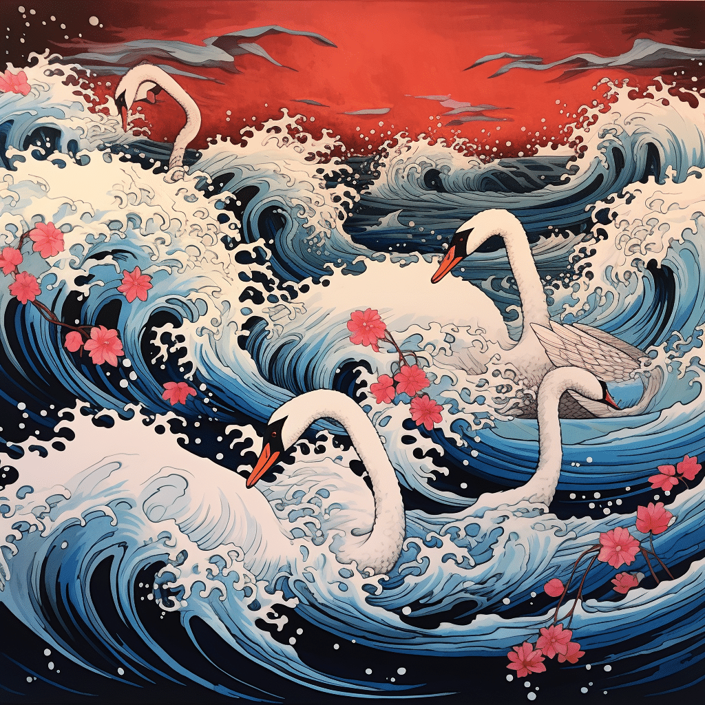
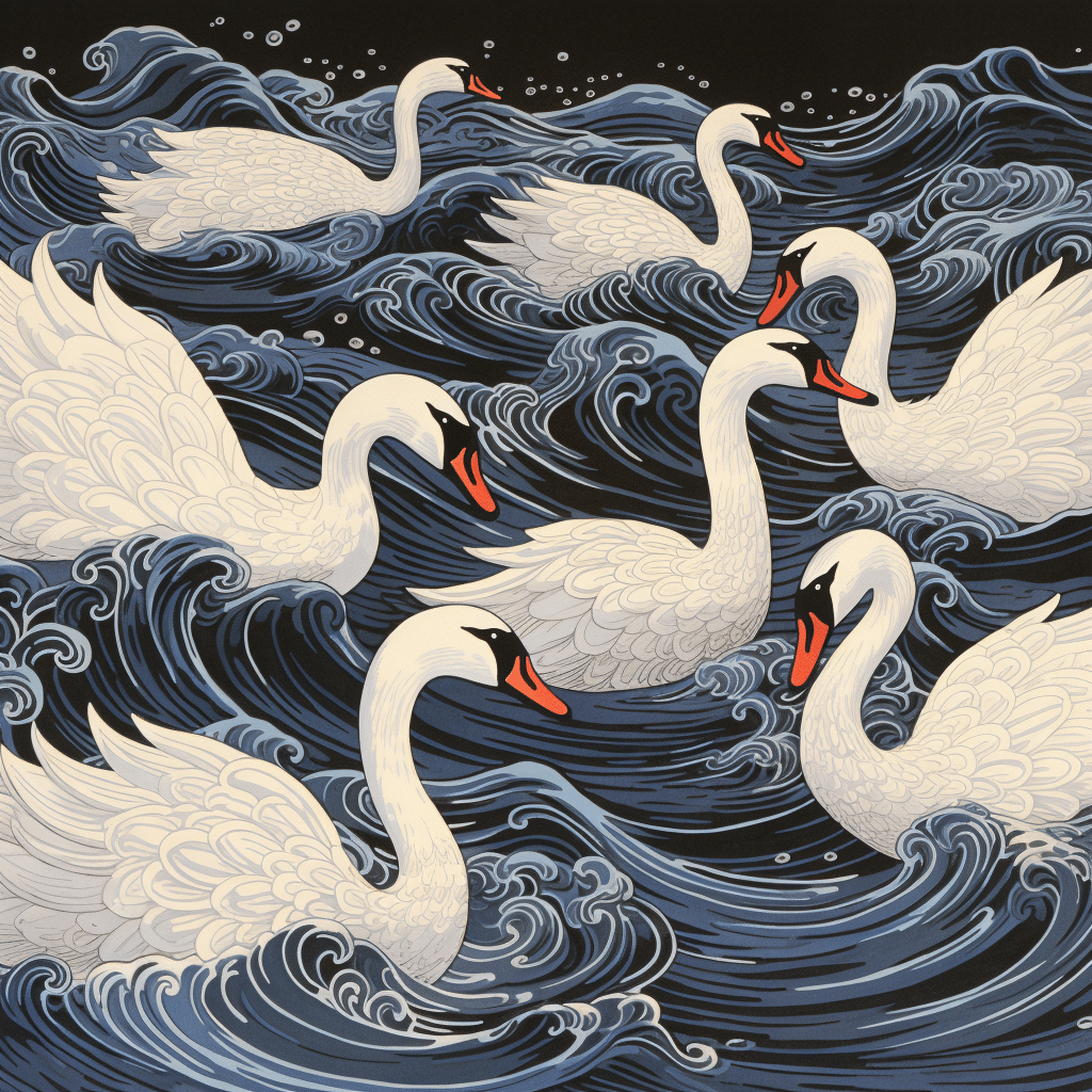
7. Seven Swans a-swimming, ukiyo-e style
Fail: More like four swans a-drowning.
Final: The Great Wave of Kanagawa is a prime example of this style of artwork. When trying to create swans, many of the early renders felt like these poor swans were being caught in a tsunami! Here they are, paddling for their lives, albeit in calmer waters.
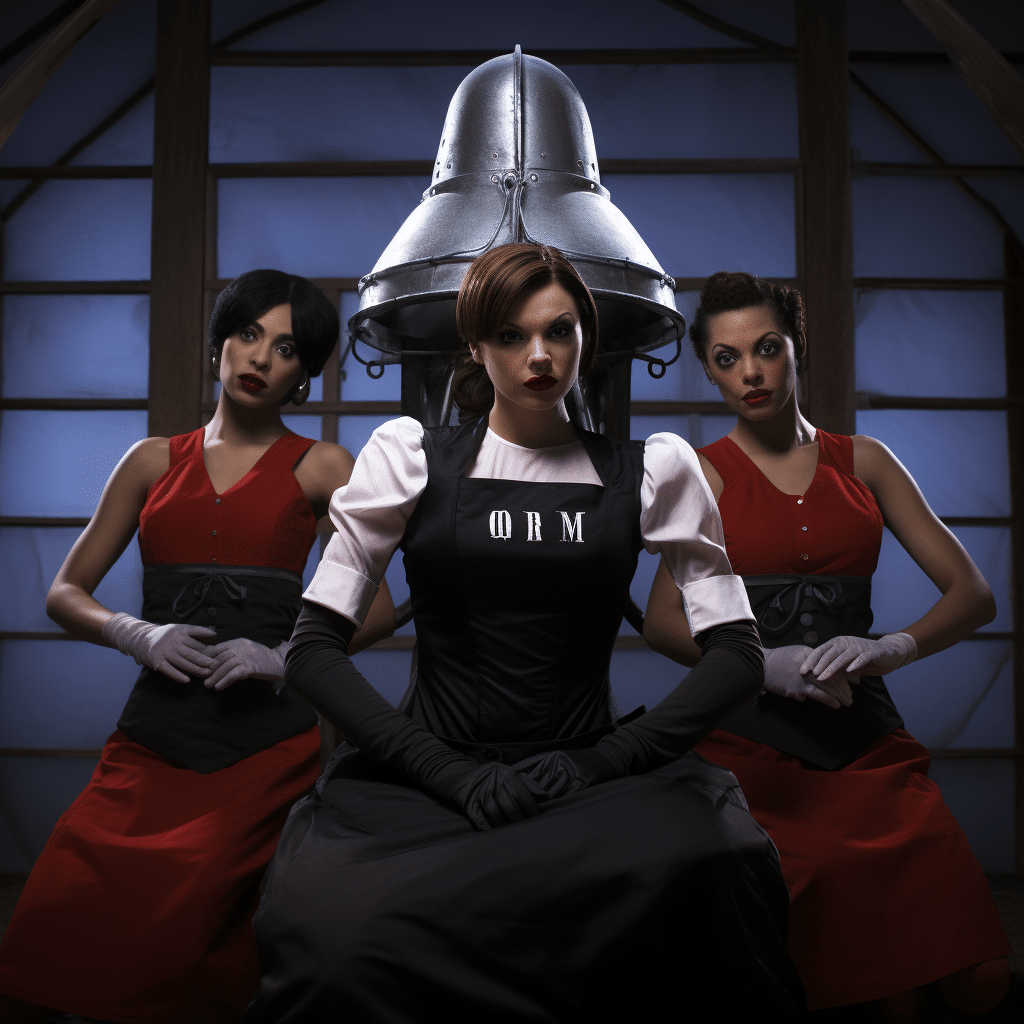
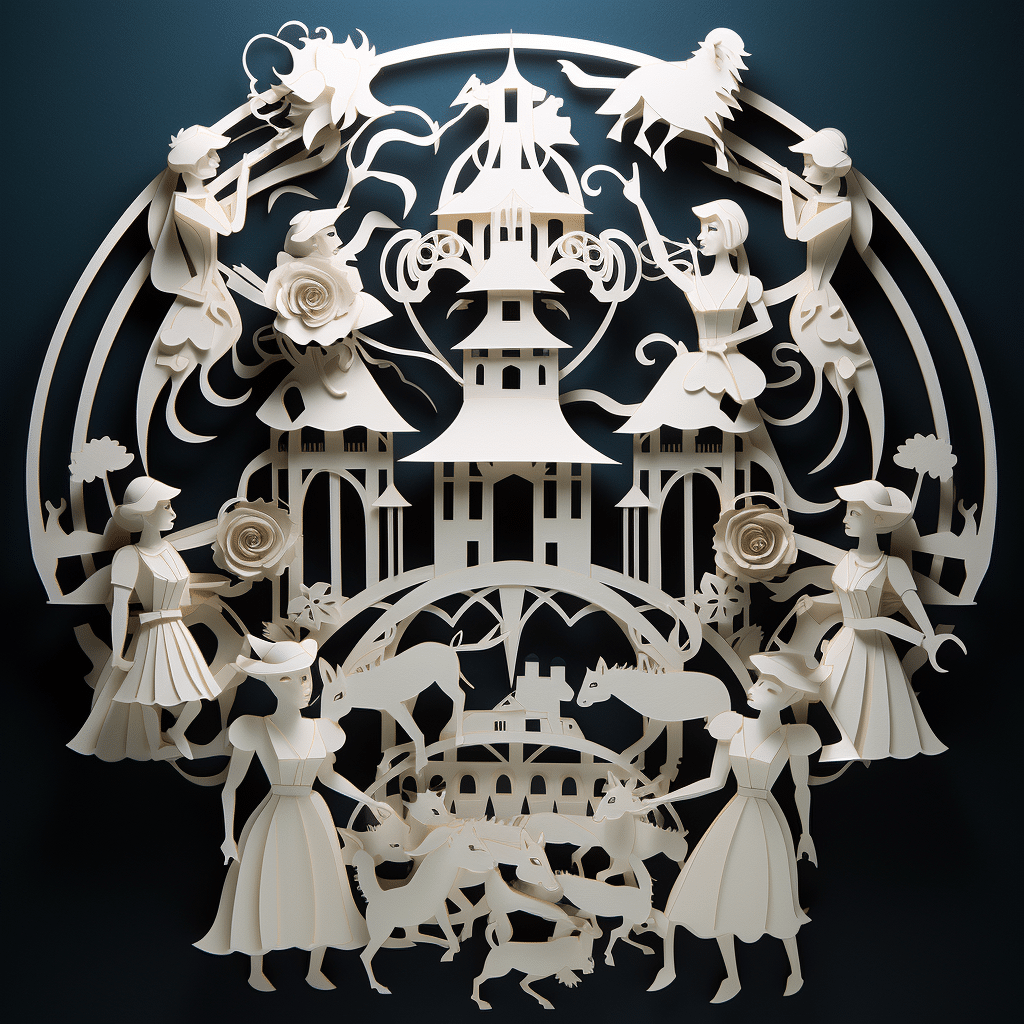
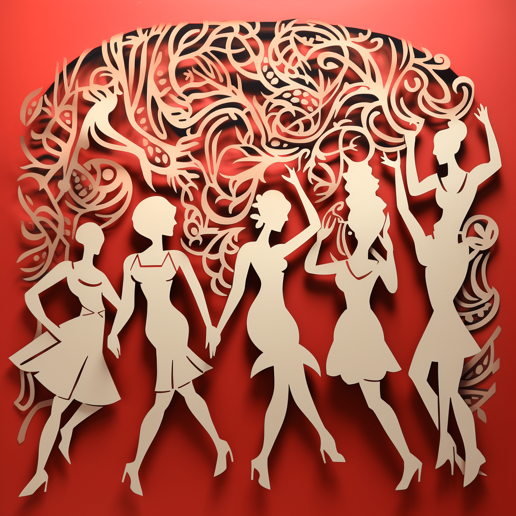
8. Eight Maids a-milking, papercut style
Fail: This will haunt my dreams, but I didn’t know what to expect.
Final: This is where things became tricky – AI doesn’t seem to quite understand the anatomy of a human being (or numbers). The first attempts didn’t understand what we were looking for, but at last, it provided ladies and (maybe) goats to create the feeling of this prompt. Not sure why the pig is joining in. Maybe just for laughs? It’s quite the menagerie.
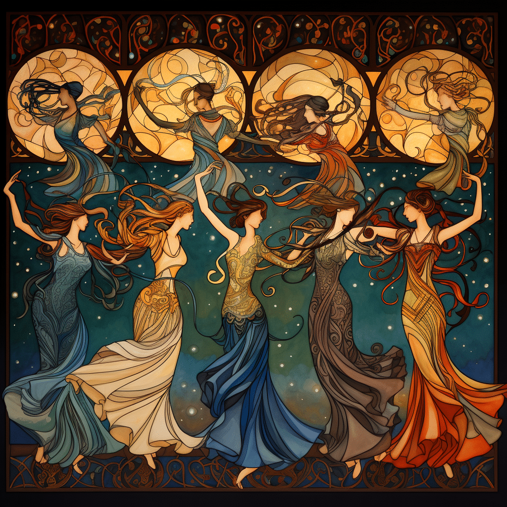
9. Nine Ladies Dancing, Art Nouveau style
Fail: It was almost impossible to render nine ladies in the paper-cut style with the appropriate number of ladies with the correct number of limbs.
Final: After the harrowing experience of trying to produce milkmaids, we knew we were in for another challenge with more people-based prompts. While the style of this one went much smoother, many of the first attempts were either set at eight or ten ladies, so it took a few refreshes to finally land at nine.
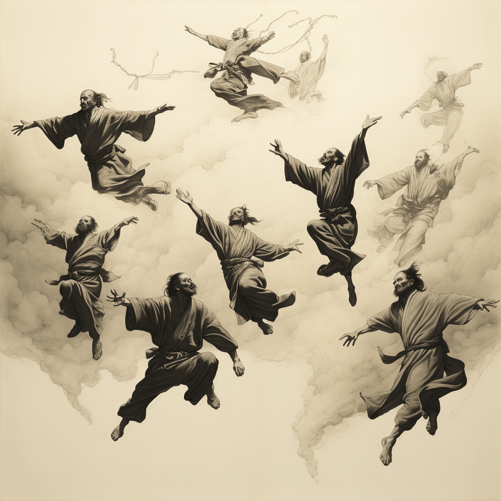
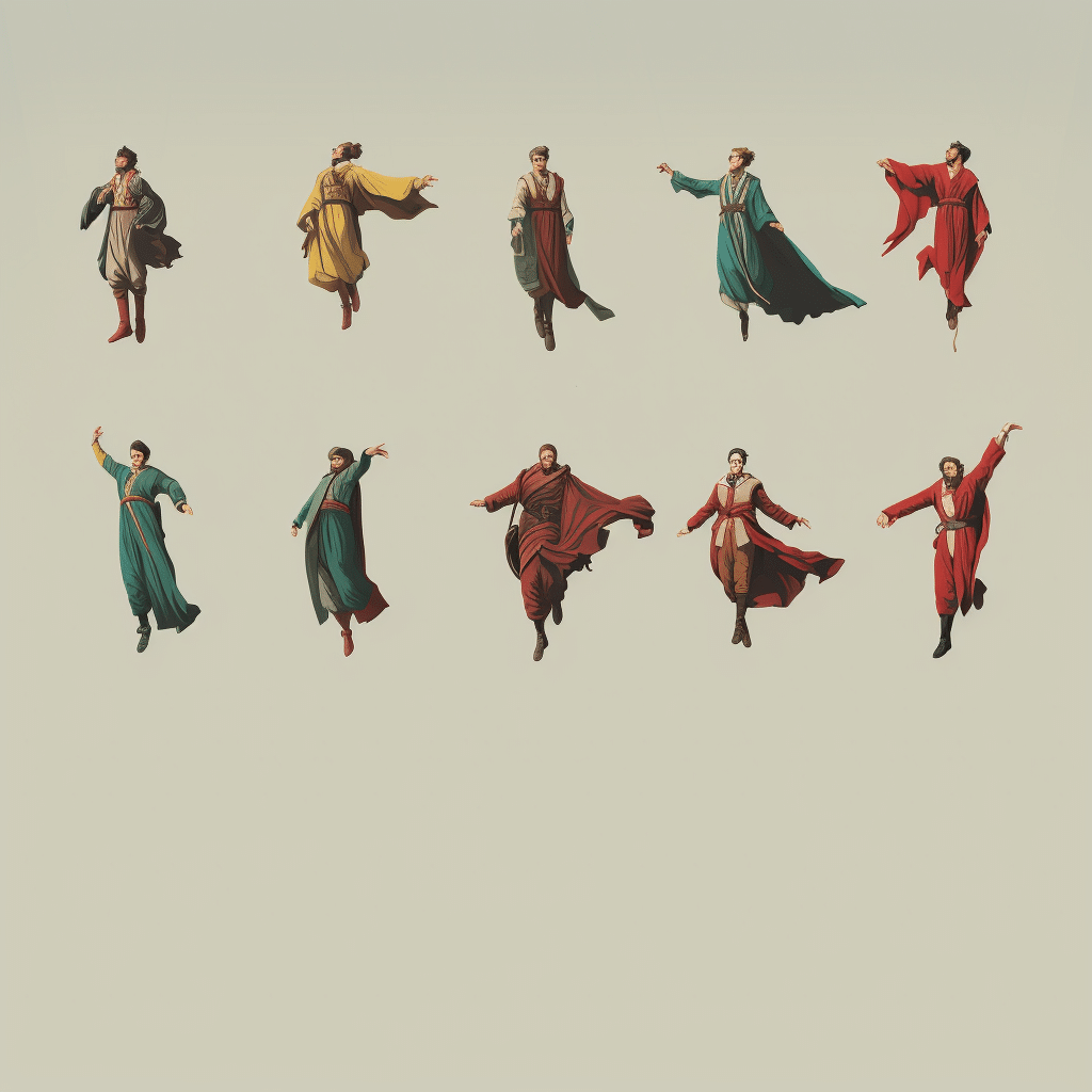
10. Ten Lords a-leaping, minimalism style
Fail: This is a twisted Harry Potter situation. We wanted a Japanese ink art style, but the faces were terrifying, and there were feet for hands.
Final: Yet another challenge at getting the correct number, but we enjoy these gentlemen dancing to the beats of their own drums. Fancy footwork, fellas.
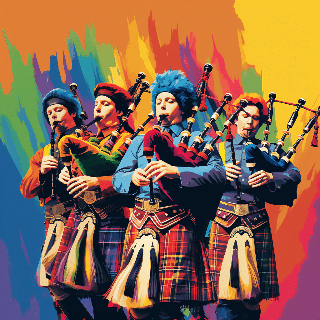
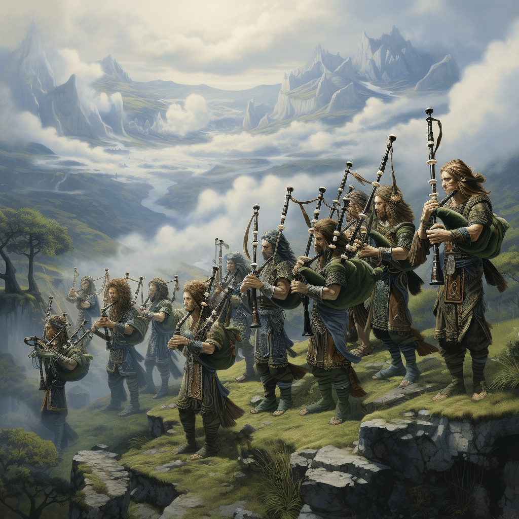
11. Eleven Pipers Piping, fantasy art style
Fail: Gross. We tried a half dozen times to make rococo style work, but eleven deemed impossible.
Final: Should have expected Braveheart. That’s all.
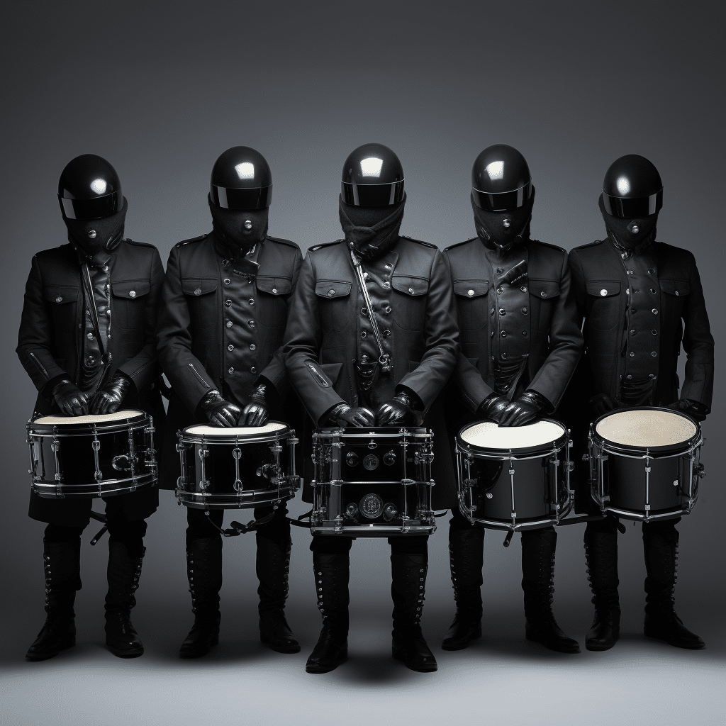
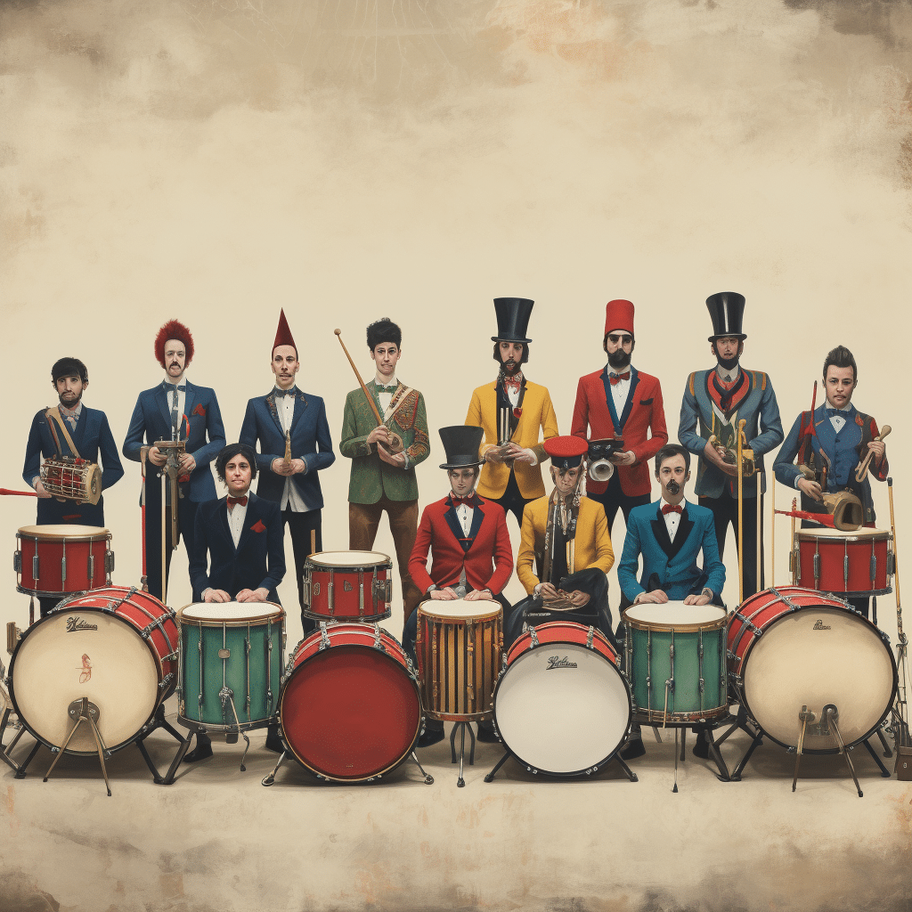
12. Twelve Drummers Drumming, no style specified
Fail: We were never going to be able to get ten drummers in this style, even though it was an interesting direction.
Final: While not all of the “drummers” have a drum, we liked this choice for style and color usage. 10/10 would listen to their band. After struggling with the people-based prompts we decided that sometimes, no specific style is the best style.
Overall…
We had difficulty getting MidJourney to render the correct number of elements. Getting ten, eleven, or twelve of something was the biggest challenge. We also had a tough time creating faces that were not disturbing or warped and the correct number of limbs in more expressive styles.
We tried other AI tools, including Stable Diffusion, but the wait time was unbearable, and the results were underwhelming. We also tried Image Creator by Microsoft Bing, but the results were not nearly as sophisticated as MidJourney.
Our advice is…
- Be patient and keep experimenting
- Look closely at the results because you may miss something disturbing
- Keep the language and ideas simple
- Apply a style is key to avoiding that AI look
The takeaway?
In terms of brand design, Illustrators, designers, and writers are safe for now – AI isn’t sentient yet. It needs us more than we need it, but it has a different purpose too: to enhance ideas and open our minds to new creative directions or interpretations.
So yes, while we can’t say any of these exactly nailed our visions, we can’t say we weren’t completely delighted when the final creation finally appeared either. Fingers crossed, you’ll enjoy exploring some of these tools during your own idea generation, and perhaps, even crack one of those ideas.
If you find that your brand could use help with brand design, hire us – a team of humans, not robots – to help. Contact us today.


